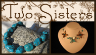
 Just for comparison, here's our business card.
Beth & Valette spent HOURS working on it: looking for fonts on line, playing with it and getting it just right.
The weird thing here is all the white around the edge and how pale the writing is- I wanted to enlarge it just a little and that messed up the scanner, I guess. The writing on the card is normally quite neatly centered & dark enough to be legible... I'm not computer illiterate, but after scanning it four times I'm not gonna play with it anymore today!
The ONLY thing we'd probably change at this point is adding the web-site address. Originally, when they designed the card we didn't have the jewelry blog. Since Valette designed it for us and locked it we don't know how to add the website address on the computer. We don't have all the fancy programs she has for designing stuff, so we've been adding it by hand at the bottom- very annoying and time-consuming.
So, while I'm willing to take comments on it, we're pretty happy with it. :) We know it's got a LOT of words on it, but it's got what's important to us.


No comments:
Post a Comment